UI & UX Design Ideation and Execution
ServiceLink is one of the leading end-to-end mortgage companies, providing a variety of services and products to customers. Upon joining the team, one of my main roles was to update and improve the UX and UI of outdated products that no longer served the needs of the user. Below is an example of one of my projects and the process I used to improve the product from start to finish.
What is the Project?

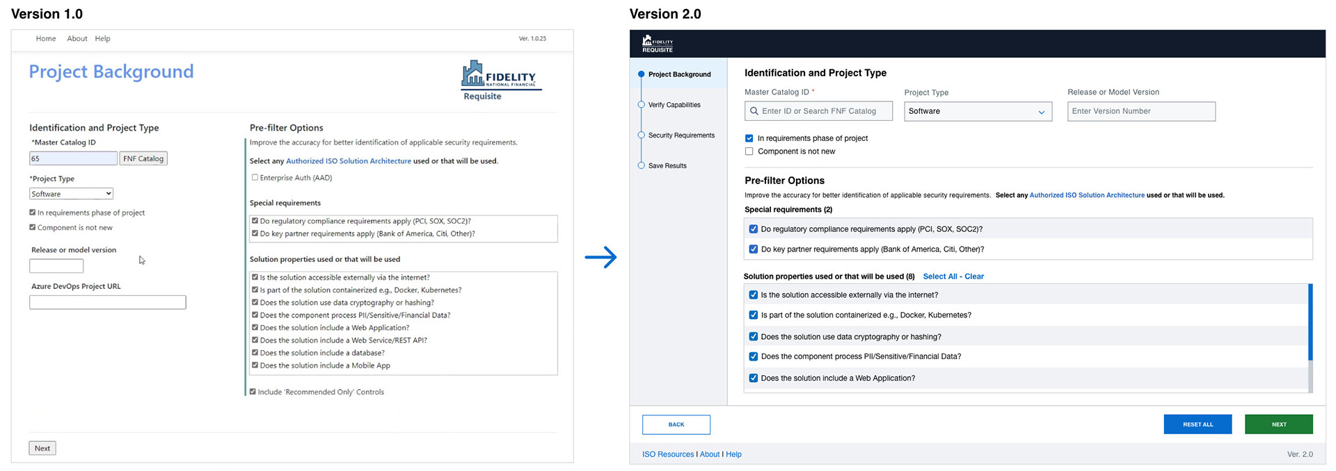
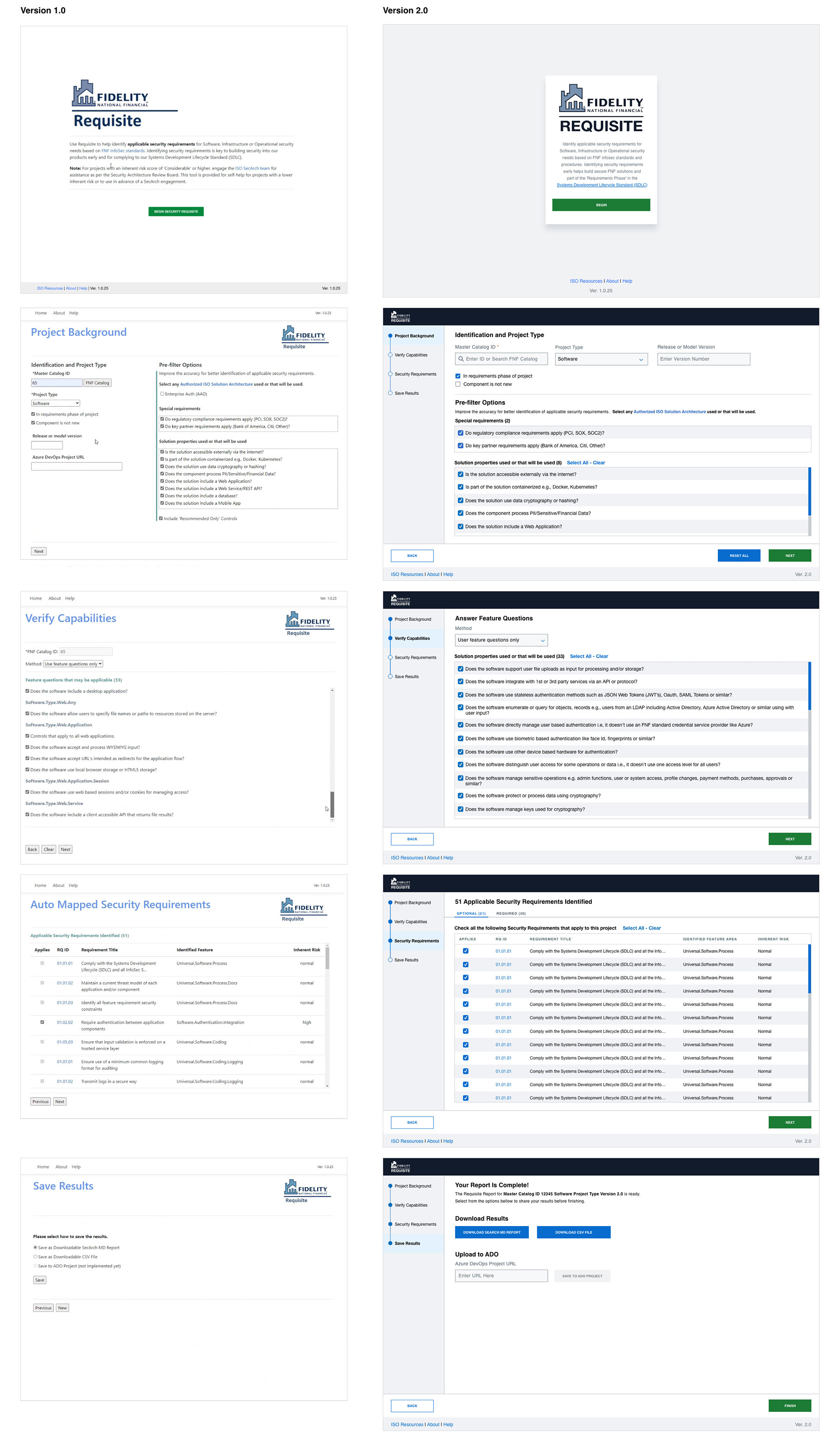
Many products at ServiceLink must meet a series of security requirement specifications written out at the beginning of the development cycle. Instead of relying on expensive 3rd party applications to prompt these specifications, ServiceLink relied on a product built by a lone in-house developer.
The software was designed to ask Project Managers a series of questions about the new product's features using various inputs. The final output was a generated list of security requirements and a series of options to export and share this list.
I was brought on to improve and implement ServiceLink's design standards which emphasized accessibility, scalability, and intuitive use.
Identifying Pain Points
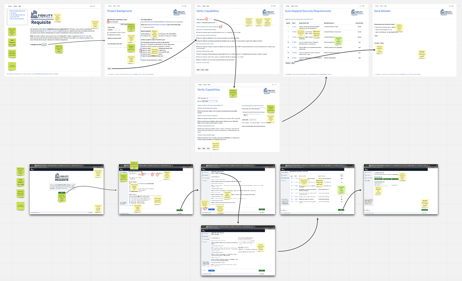
My first step in this process was to meet with the developer to better understand the software and its intended user. Keeping this information in mind, I then explore all application states and various flow outcomes by interacting with the software on my own and also by watching users interact with the software.
Through this process, I am able to identify the main pain points:
• The designs are unresponsive and not aligned with our company’s design language.
“These buttons and layouts look messy and act strange.”
• There is no indication of user progress or place in the current flow.
”How much work do I have left? What have I already done?”
• The layout of inputs is confusing and only seasoned users understand what to do.
“I’m not sure what I’m looking at, and not sure what to do first.”
How Do We Solve This?
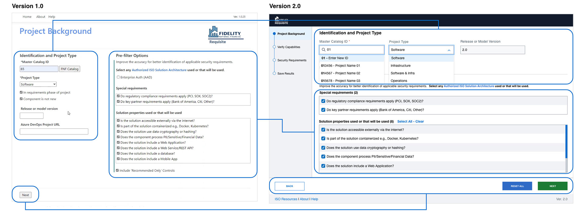
To address the first pain point, I updated the layout with components and assets from our design language. This means appropriate buttons, headers, footers, and input fields were added. Next is refining the flow of these inputs so that they read up and down, in the order in which they must be completed. Additionally, in my new design information only appears to the user only when it must be completed, simplifying the flow and making it more intuitive.

To address the second pain point, I included a progress stepper to act as the main navigation for the user. This also allows users to be aware of their progress through the task.

To address the final pain point, my design contains components and standards set by the design team and is consistent with other software that users interface with. Additionally, this new layout is built in a way that will be accessible at different responsive views and would be WCAG compliant.
The Version 2.0 Results
After leading internal presentations and demos, we reached a final product that addressed the past pain points with the following feedback from stakeholders and users:
• The designs are unresponsive and not aligned with our company’s design language.
"The application works great and was clear in how it works.”
• There is no indication of progress or place the user is in this flow.
“I know where I am in this process and have a better understanding of what needs to be done."
• Layout of inputs is confusing and only seasoned users understand what to do
“The product flows much easier and there are fewer users confused reaching out for help.”
By refining the UI & UX experience of this application, ServiceLink continues to save money by not relying on a 3rd party product subscription. Additionally, they offer employees a tool that increases productivity and clarity of internal product design specifications.
This is one of many examples of components, products, and internal flow that I had the pleasure of working on during my time at ServiceLink.
App Store & Google Play Graphics
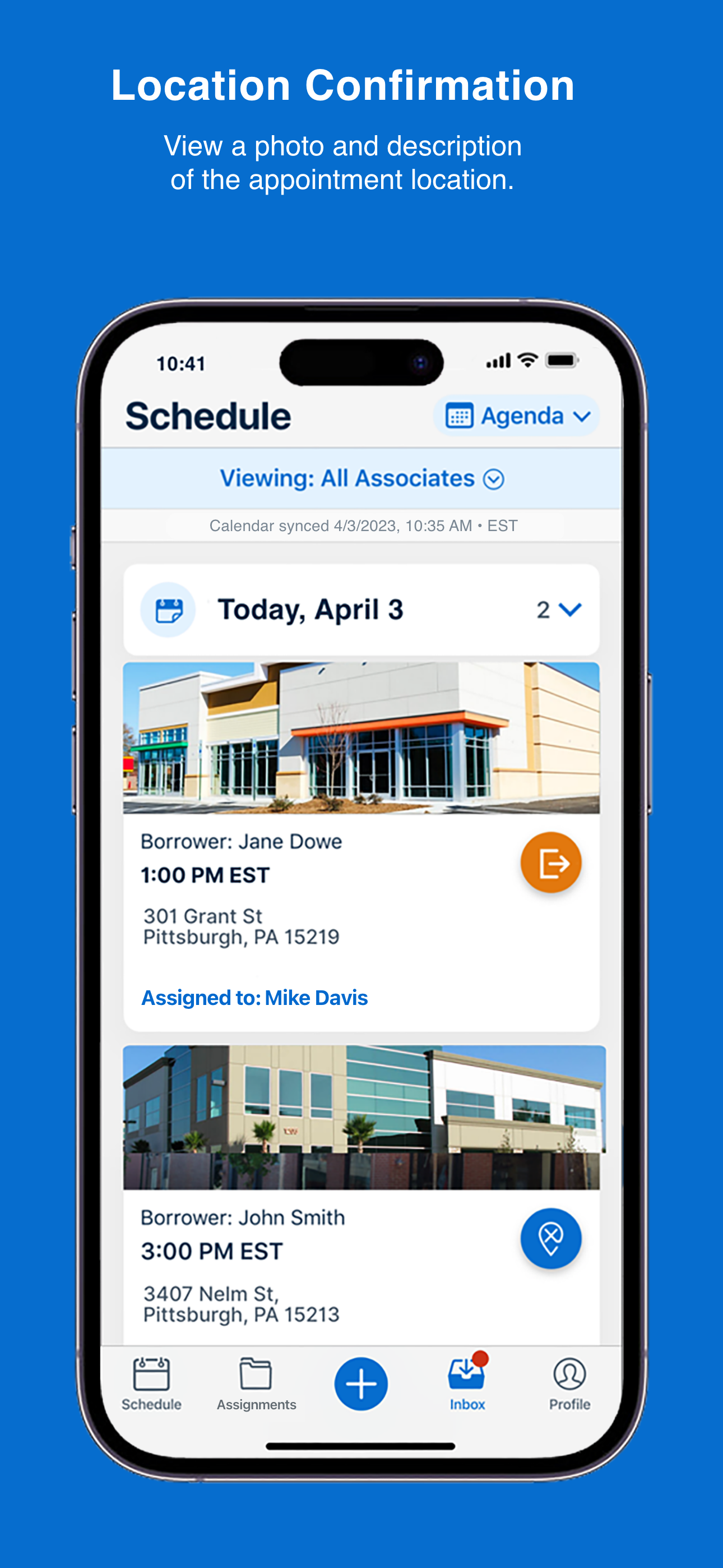
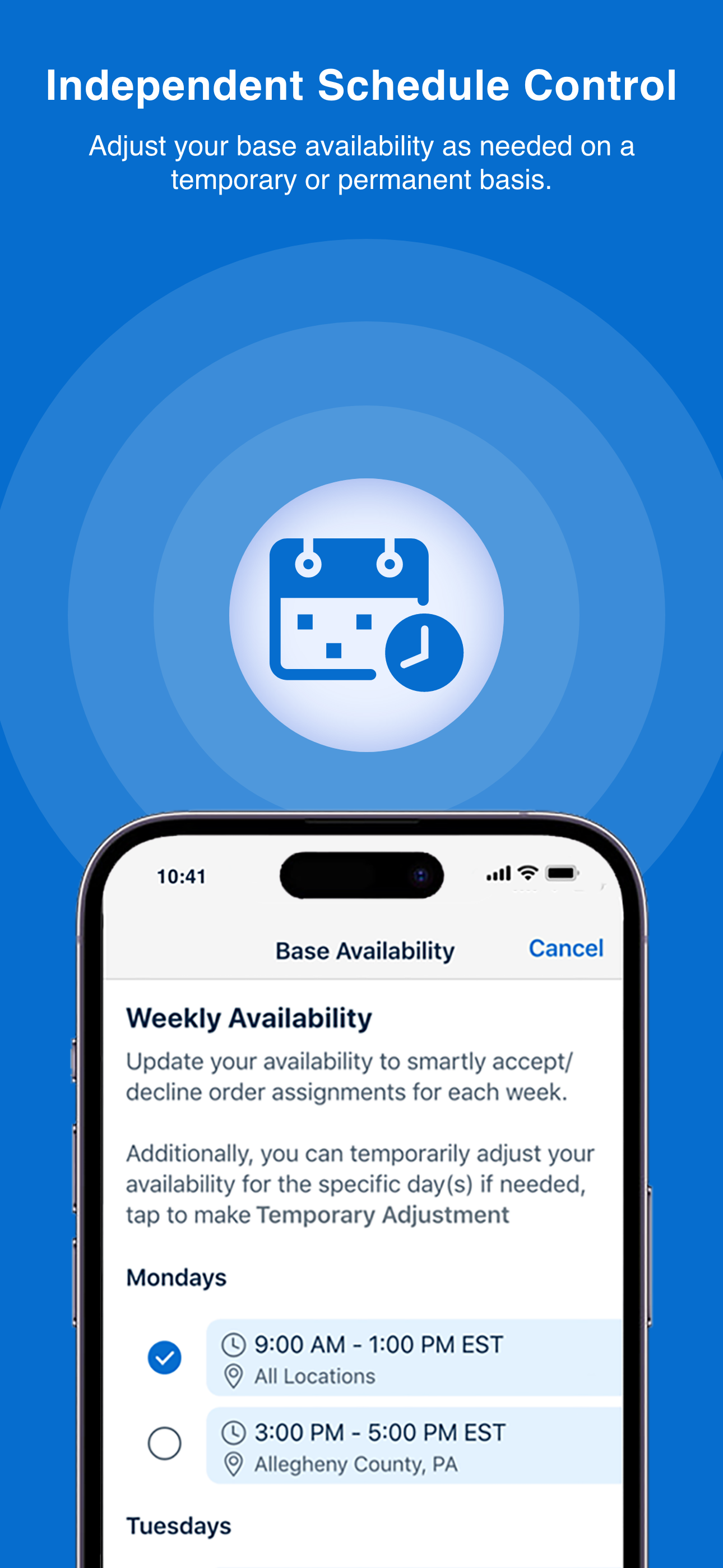
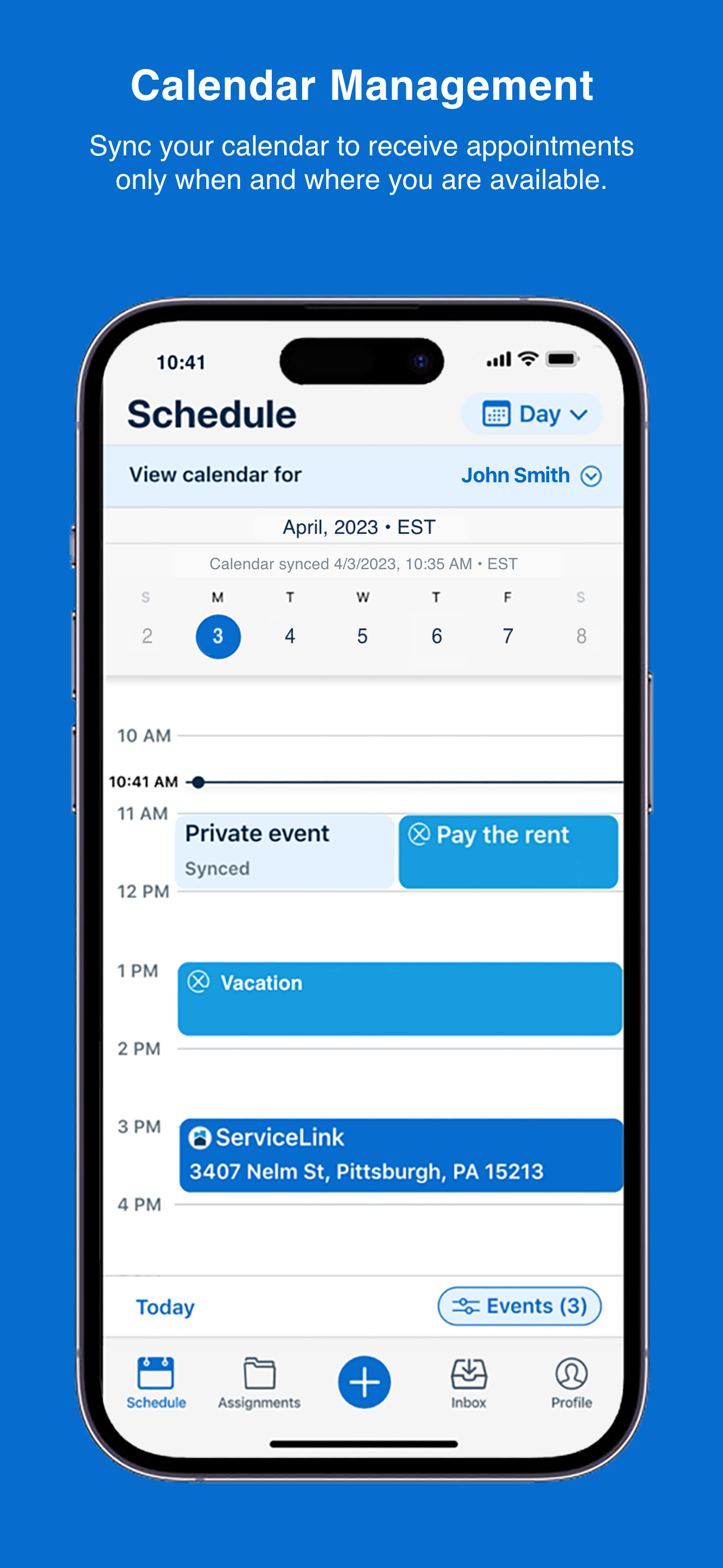

I developed a series of graphics for the App Store and Google Play store to represent the suite of products in engaging informative graphics. Here are examples of one of our products App Store graphics. I made several versions of these to accommodate different iPhone resolutions as well as iPad and Android phone and tablet versions too.
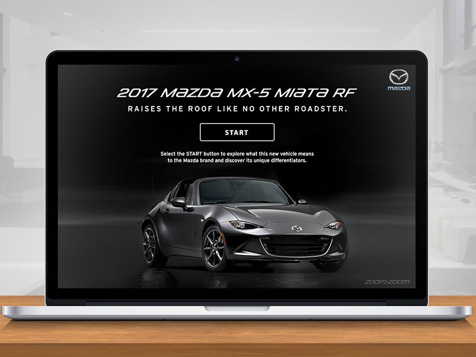
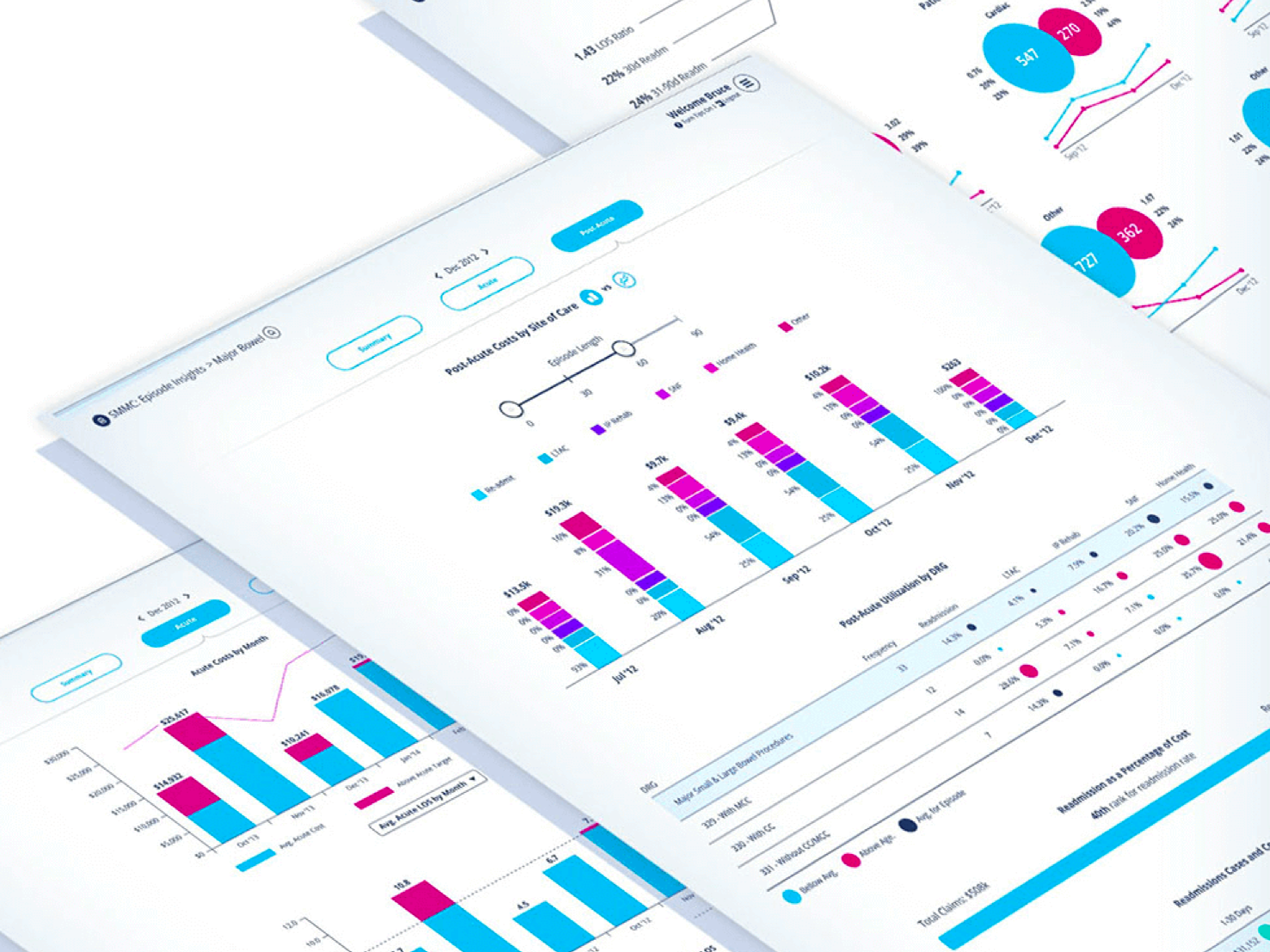
Marketing Presentations, Demos and Prototypes

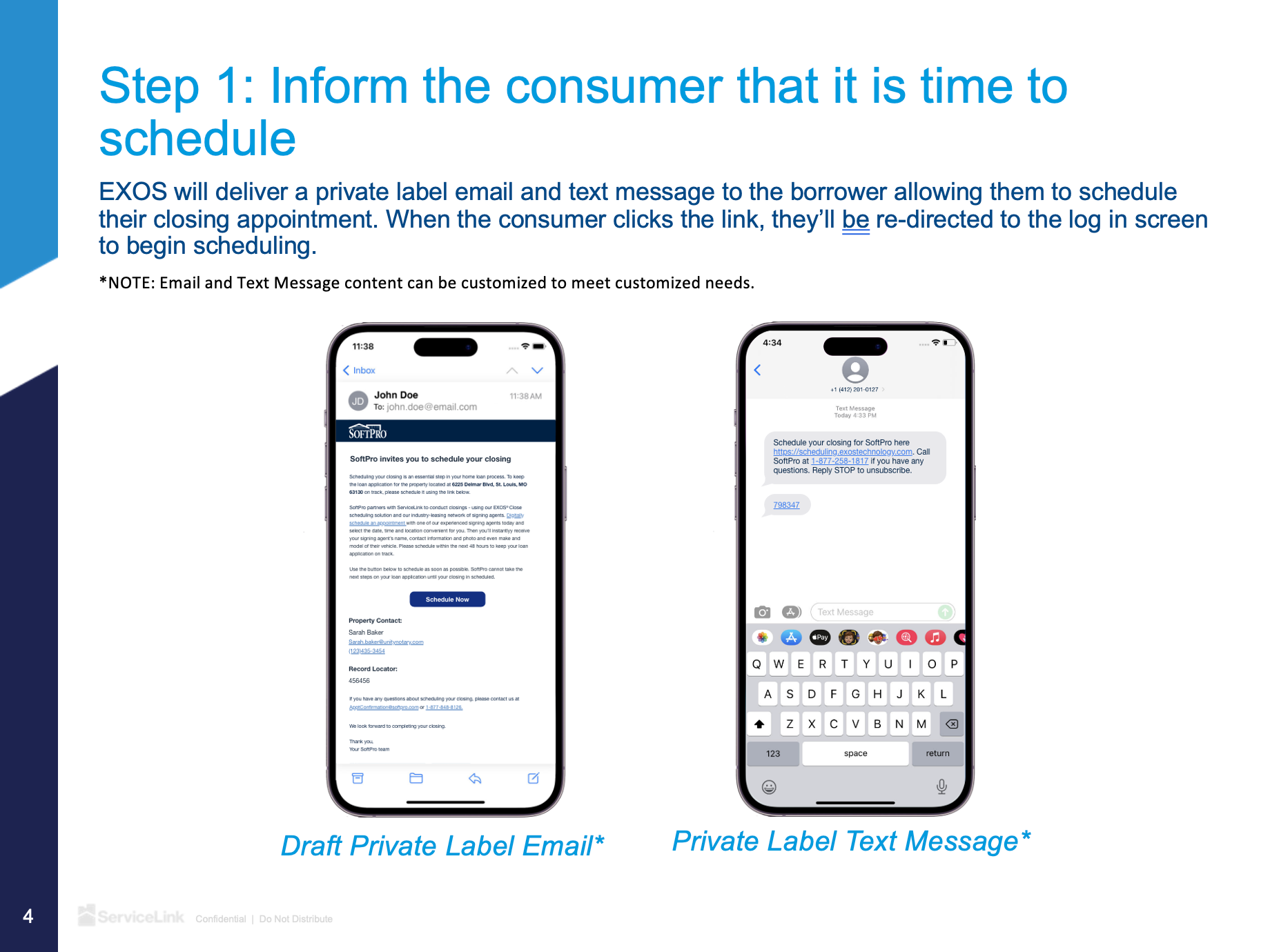
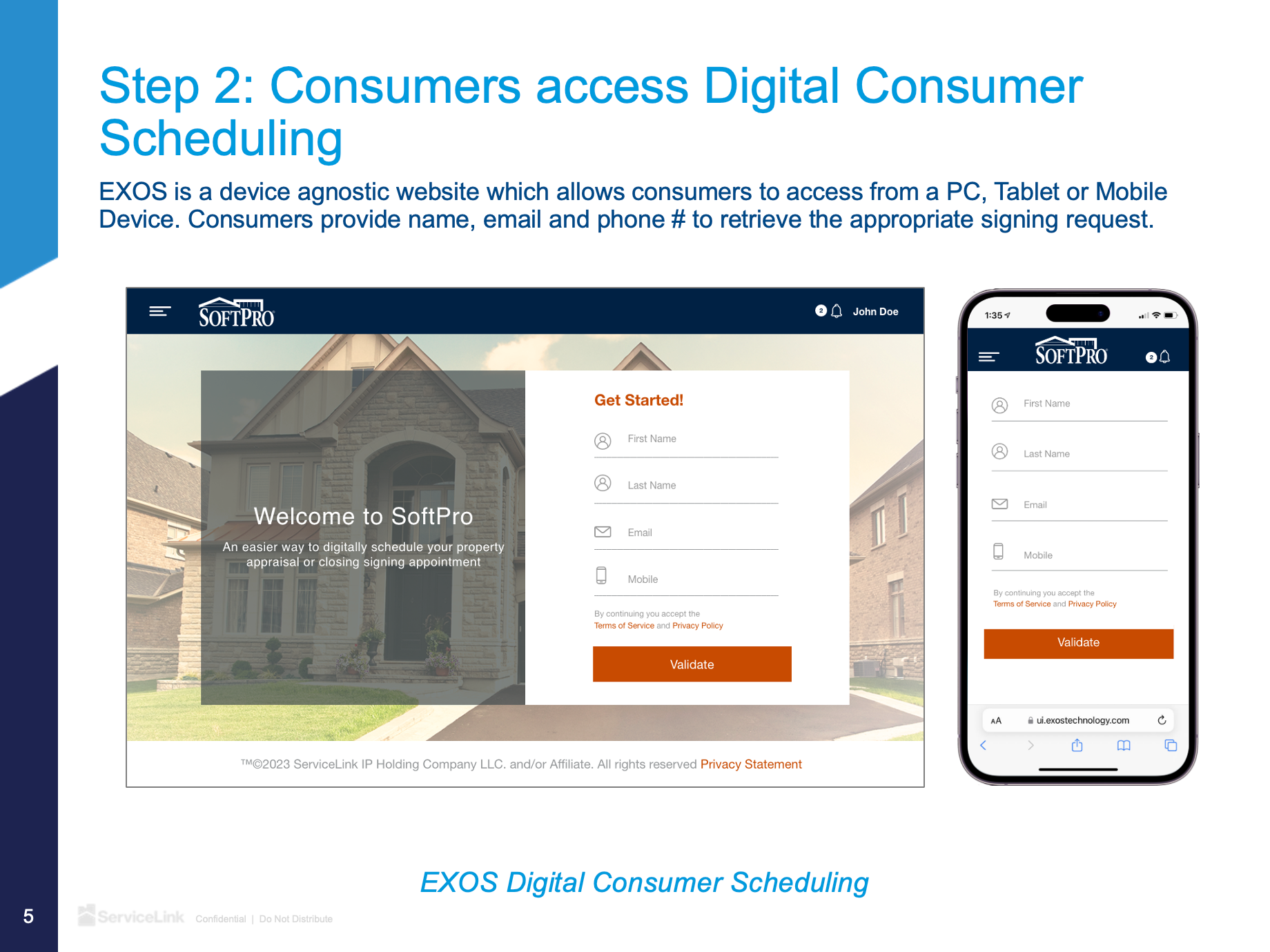
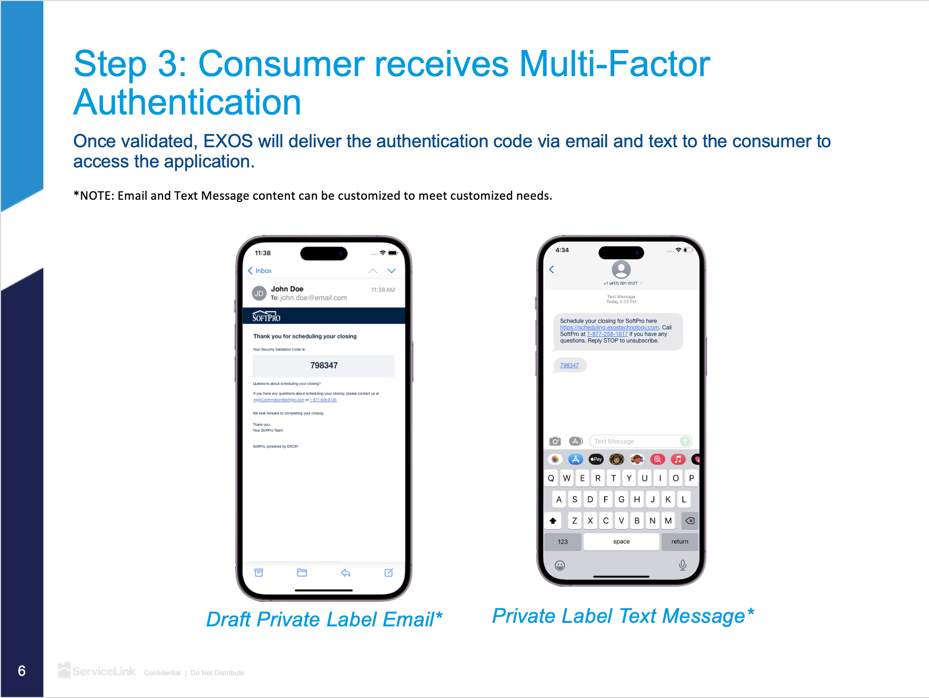

I worked closely with our marketing department to develop presentations and prototypes used to win new business to demonstrate the utility of our technology. Here are examples of a white-label presentation that won ServiceLink new business. This presentation was also accompanied by demos I created in Figma.

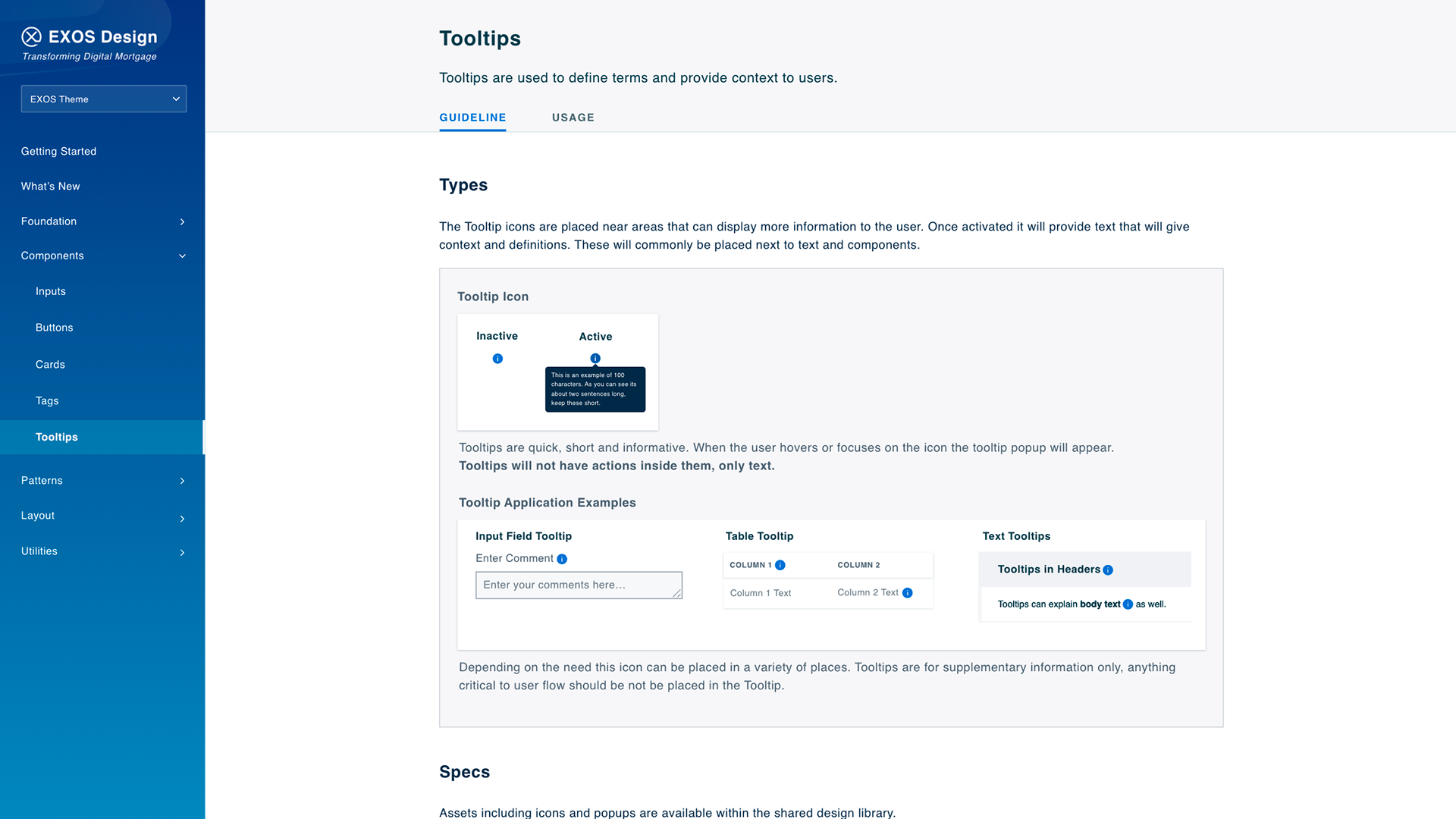
I made contributions to our design language. Which included new components, rules, and features that were integrated into our products. I collaborated closely with developers and fellow designers to ensure usability, scalability, and accessibility. Here are examples of the Tooltip and Upload Components which I designed and wrote out the specifications for.